How Thomas Cromwell Put Himself Into the Bible
Our analysis revealed a new – and hitherto unknown – plot by Cromwell to literally change the balance of power on the Bible’s front page.
Eyal Poleg, Queen Mary University of London and Paola Ricciardi, University of Cambridge
The Great Bible is often seen as a monument of English reform – but could it also contain the first known example of political photoshopping in early modern England? Printed in 1538-9, it was to be purchased by every parish church in the realm. Its creation was overseen by Henry VIII’s chief minister, Thomas Cromwell. The Great Bible ushered in the English parish Bible and its large size and meticulous printing set the bar for centuries to come. Nowhere is its iconic appearance more evident than in a unique presentation copy made for the Tudor court. This copy was printed on vellum and hand-coloured by highly skilled illuminators.
I encountered this lavish copy while carrying out an in-depth study of the production and use of Bibles in late medieval and early modern England. Researchers have long known about the Great Bible and used its striking title page for illustration. But little or no scientific analysis has ever been carried out on it. So I asked Paola Ricciardi, scientist in residence at the Fitzwilliam Museum in Cambridge, to help me with a new investigation which utilised the latest technology to study the Bible in forensic detail. The results blew us away.
Our analysis revealed a new – and hitherto unknown – plot by Cromwell to literally change the balance of power on the Bible’s front page, just one year before his execution for high treason. We plan to publish our research results in full later this year.
This article is part of Conversation Insights
The Insights team generates long-form journalism derived from interdisciplinary research. The team is working with academics from different backgrounds who have been engaged in projects aimed at tackling societal and scientific challenges.
As Lord Privy Seal and Vicegerent in Spirituals (Henry’s deputy in matters relating to the church), Cromwell was the most powerful man in Henry VIII’s court. Henry’s break from the Catholic Church and the dissolution of the monasteries became an opportunity for Cromwell to advance religious reform. For Cromwell, support for a vernacular Bible (translated into English for the general population) was linked with obedience to the King. But he had to counter a strong opposition and a substantial conservative faction in court and within the church. Henry’s support for religious reform was always limited. His stance on religion was influenced more by his political aims, rather than faith, so his support for a vernacular Bible was hesitant from the start.
Cromwell thought that the best way to ensure royal support was to produce a Bible worthy of royal patronage – both in its content and in its material grandeur. Such a Bible would combine Cromwell’s own evangelical leanings with the political aim of consolidating Henry’s control over the English church. Production began in Paris. English printers were simply not equipped to produce a book of the magnitude sought by Cromwell.
A letter to Cromwell from the production team in Paris dated June 23, 1538, reveals that two luxurious vellum copies of the Bible were being prepared. It reads: “We have here sent unto your lordship two examples, one in parchment, wherein we intend to print one for the King’s grace, and another for your lordship.”
Printed on parchment and meticulously hand-coloured, these copies have survived – one at the National Library of Wales and the other in St John’s College, Cambridge. In November 2019, with the kind assistance of St John’s College, we engaged in a technical and scientific investigation of their copy of the Great Bible.
Scientific Analysis
We employed various non-invasive analytical techniques to examine the St John’s Bible, including X-ray fluorescence (XRF) spectroscopy, reflectance spectroscopy (in the ultraviolet, visible and near-infrared range), high-resolution digital microscopy and advanced technical imaging. Scientific investigation of works of art has much to offer and is more reliable for material identification than visual analysis (historically the primary identification method for painting materials and techniques).
The focus of our technical examination of the Bible was the decoration. Knowledge of the painting materials and techniques used to decorate books can provide a wealth of information on production methods and artists’ skills –and, occasionally, on their identity. All of the hundreds of black-and-white images printed in the Bible were painstakingly hand-coloured by a group of talented artists for this special presentation Bible. In some cases, the artists did not simply colour in the print, but made significant changes to the black-and-white printed images used in the regular editions of the Bible.
Our investigation focused on 14 images, spread out across the volume. First, we used a range of spectroscopic methods to analyse a selection of small areas in each image, allowing the identification of individual pigments. The pigments identified throughout the volume were consistent with what is known about the materials used by Continental painters and illuminators during the 16th century. One of the most interesting results of this investigation was the fact that different “palettes” can be identified in different images, which suggests the presence of no less than six (and quite possibly more) artists at work on the decoration of this Bible.
The spectroscopic analysis was followed by high-magnification digital microscopy (in direct as well as raking and transmitted light). The close-up images captured using these methods not only provided greater insight into the stylistic preferences and working methods of the artists, but were also crucial in revealing the extent to which the printed images were modified at the painting stage.
From Black-and-White to Colour
We paid special attention to the Bible’s title pages. Each of the book’s five parts is preceded by a full, illustrated and meticulously hand-coloured title page. The title pages depict scenes from the parts of the Bible they precede (historical books, the words of the prophets, or the New Testament). We discovered that the St John Bible’s main front page was actually a hand-coloured adaption of the printed black-and-white version which would have been present in all the mass-produced Bibles. But this luxurious front page – meant for the eyes of King Henry VIII – contained some key differences, as the slider image below illustrates.
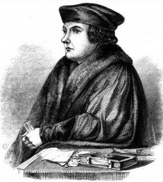
The main black-and-white title page depicts an ideal scenario in which the majestic Henry VIII distributes bibles to lay and religious subjects, assisted by two of his faithful ministers – Thomas Cranmer, Archbishop of Canterbury, and Cromwell. Renowned art historian Tatiana String believes the printed title page was the visual manifestation of Henry’s authority. Henry reigns at the top of the page, distributing bibles to laypeople and clerics, aided by Cromwell to his left and Cranmer to his right (each identified by his coat of arms). The Word of God then reaches the general public in the lower part of the page, who duly proclaim “vivat rex” and “God save the king” (apart from those in prison, who are seen on the bottom right and shout nothing).
This black-and-white title page of the Bible masterminded by Cromwell, distilled his theory of scripture and obedience. The dissemination of the Bible was from top to bottom (literally), resulting in greater submission to the monarch. Its details reveal, however, that it moves away from the more radical reformation ideal of putting the Bible “in the ploughboy’s hands”. The laity at the bottom of the page do not hold the Bible, they simply listen to the Word of God preached from the pulpit. This was a nuanced and hierarchical way to disseminate the book and it reflected the unease Henry had with common people reading the Bible.
In the St John’s copy, the printed title pages were carefully hand painted, with the original print at times peeping through. For example, in the hand-coloured version the prison was obliterated and replaced by a dedication scene. The original brick background is still visible through the red stockings of the green-clad figure.
Cut and Paste Politics
The most striking modification we found has so far been hidden from scholars working on this Bible. Under a microscope with raking light, it becomes evident that some of the faces were painted on separate pieces of vellum and pasted over the existing page. A thin line can be seen under Cromwell’s face where the image was pasted in. This was done in a highly professional manner, covering much of the border area with paint overlapping the edges and creating the impression of a single image. This major modification applied to Cromwell and another key figure.
We believe that the instigator of this modification was Cromwell himself and the change had much to do with his representation on the page – a page which illustrates Henry’s complex attitude towards the lay readership of scripture, wavering between distribution and retraction. The same phenomenon, more nuanced but equally powerful, is evident in this careful modification. The pasting of Cromwell’s portrait had reshuffled political powers and affinity to the monarch.
In the original black-and-white design, Cromwell is affiliated with distributing the Bible to the laity – his coat of arms is in the middle of the page, below the figure whose features resemble Cromwell, handing the Bible (inscribed verbum dei, or “the Word of God”) to lay nobility. He mirrors Cranmer’s image, on the other side of the page, distributing a similar book to the clergy. This accorded with Cromwell’s central role in lay administration, as with his reformed leaning and his support for the printing of the Great Bible. In this image, then, Cromwell is on the level below the King and positioned in the middle of the page.